Music + Us
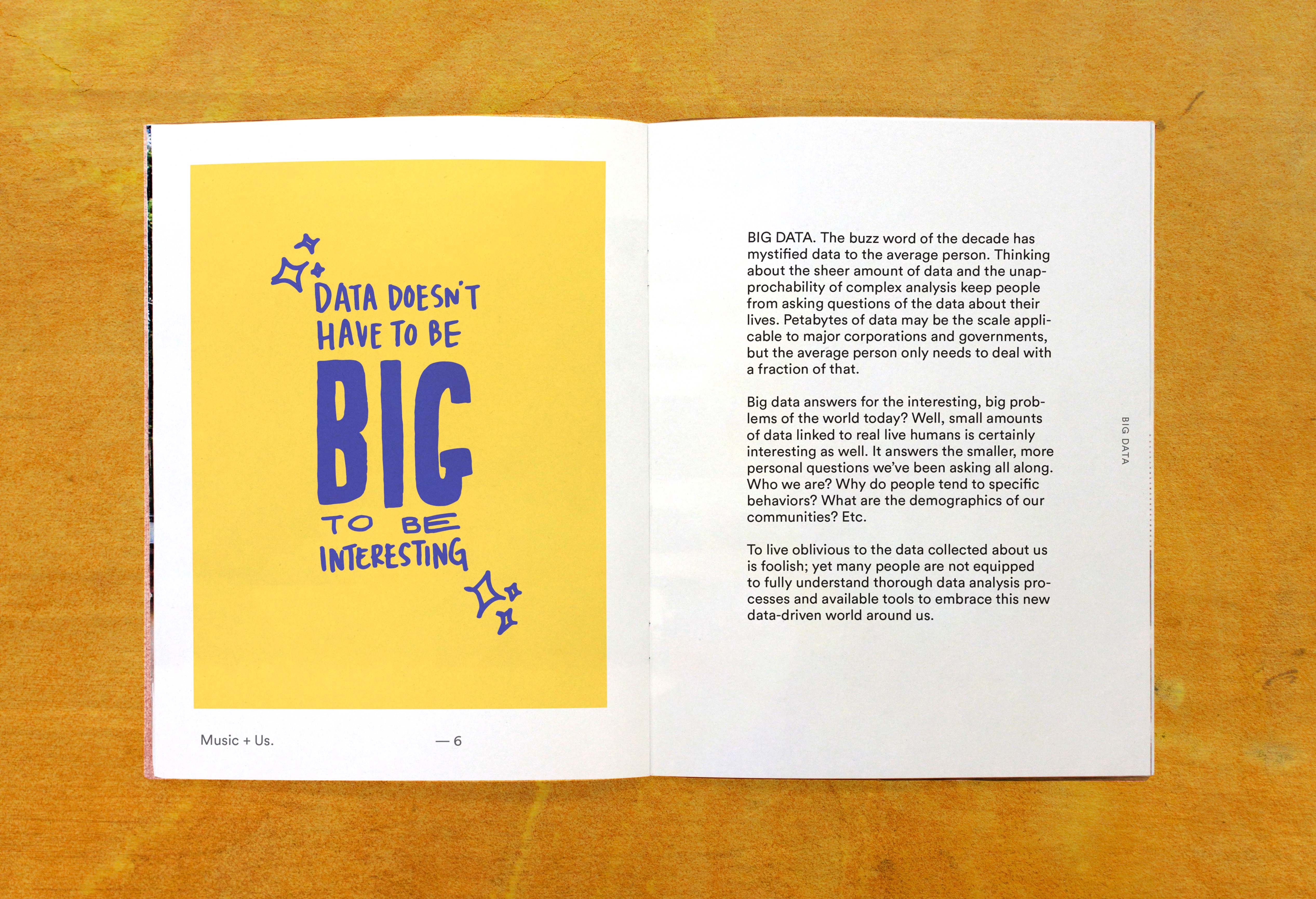
Music + Us explores how we can use the lens of music and self-quantification to make data feel human in a world where big data continues to grow and data feels increasingly abstract, impersonal, and even daunting to the average individual.
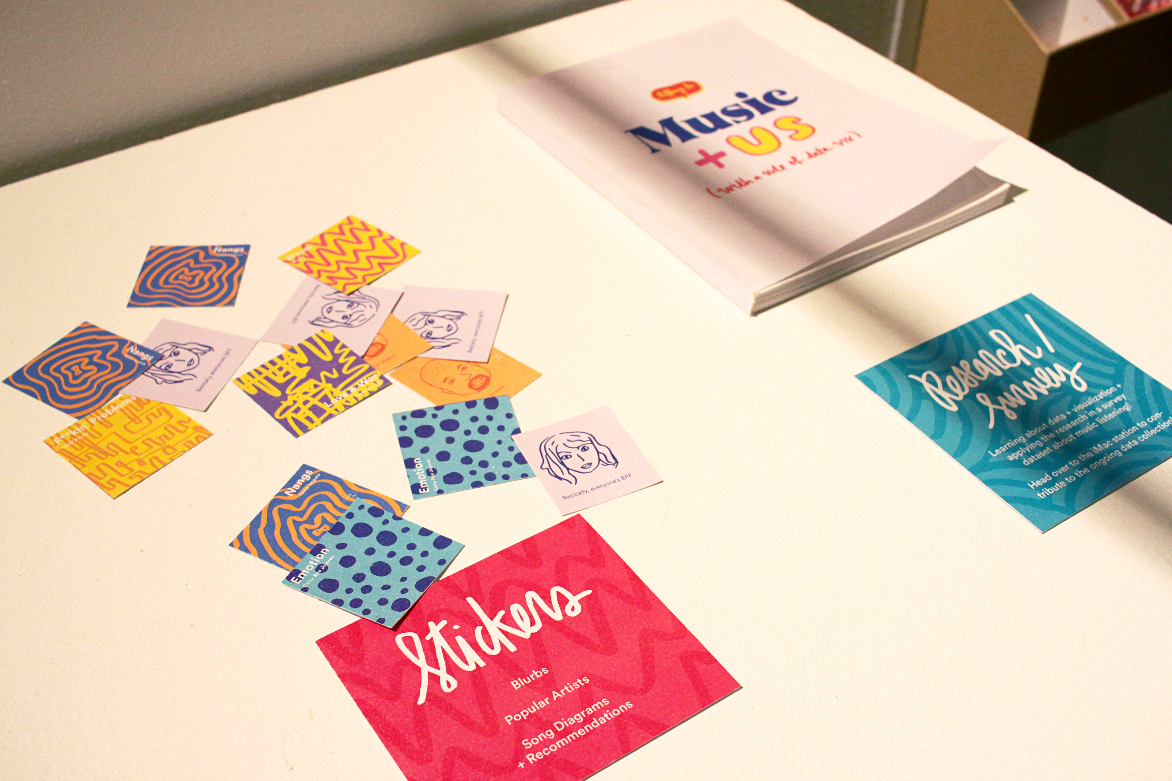
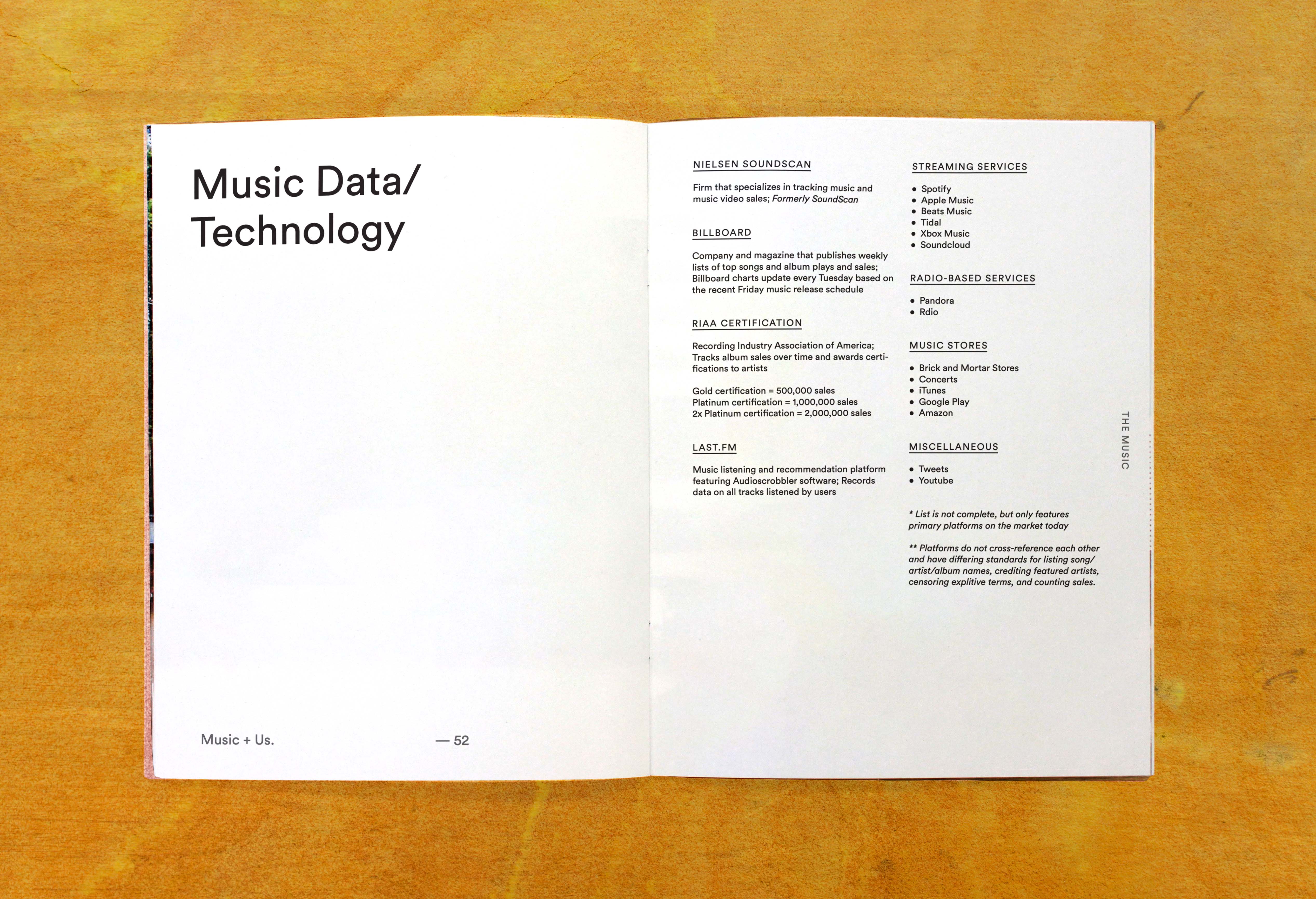
The project aimed to inform audiences about data visualization history and literacy, followed by applying that understanding to music listening data collected through a survey, Billboard Hot 100 music data, and available music metadata.
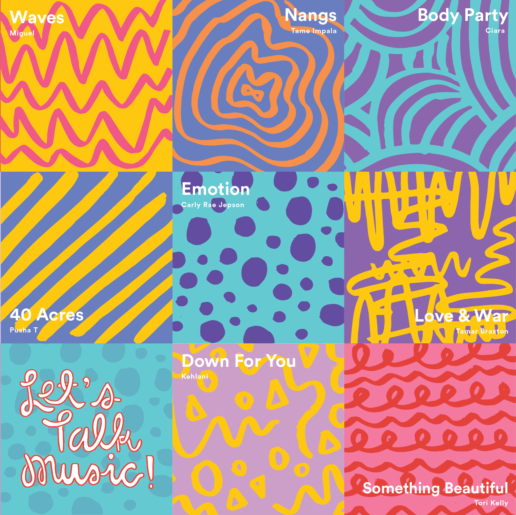
The color palette of the thesis presentation and book provide a cheerful and fun punch of color to the otherwise black and white and dry concept of data.
The contents of the book are set in Lineto’s Circular, which has an educational and familiar feel, with geometric forms that nod to the circles, rectangles, and geometries of data visualizations.

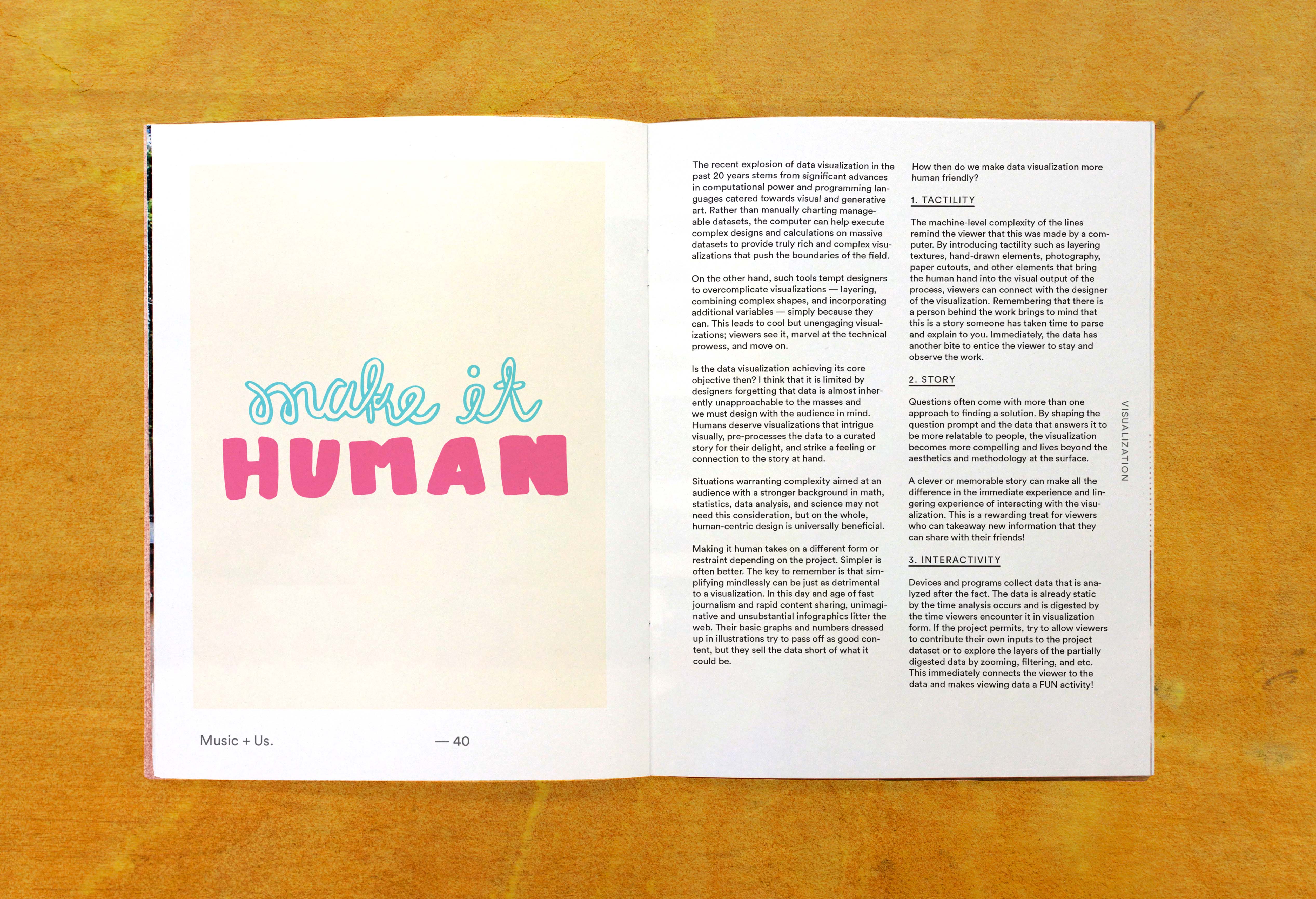
All the illustrations in the book are done by a casual brush marker style to make it feel human; Including a series of sticker designs made based on visualizing a few of my favorite songs at the time of the project.