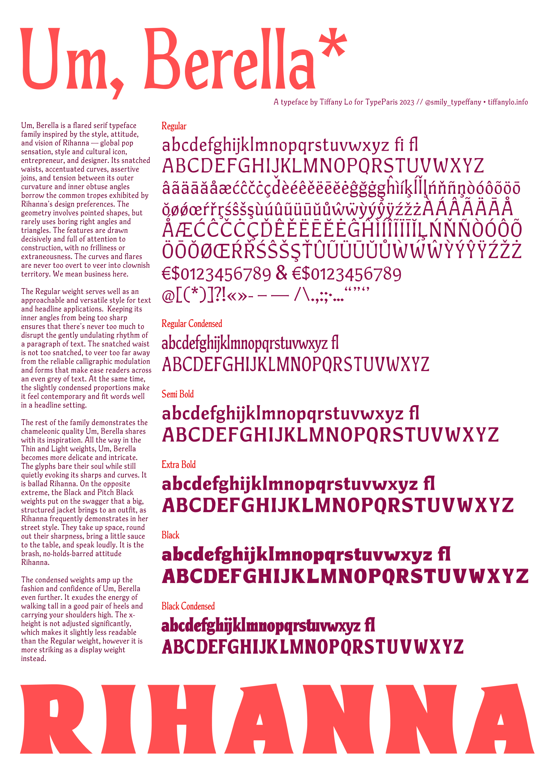
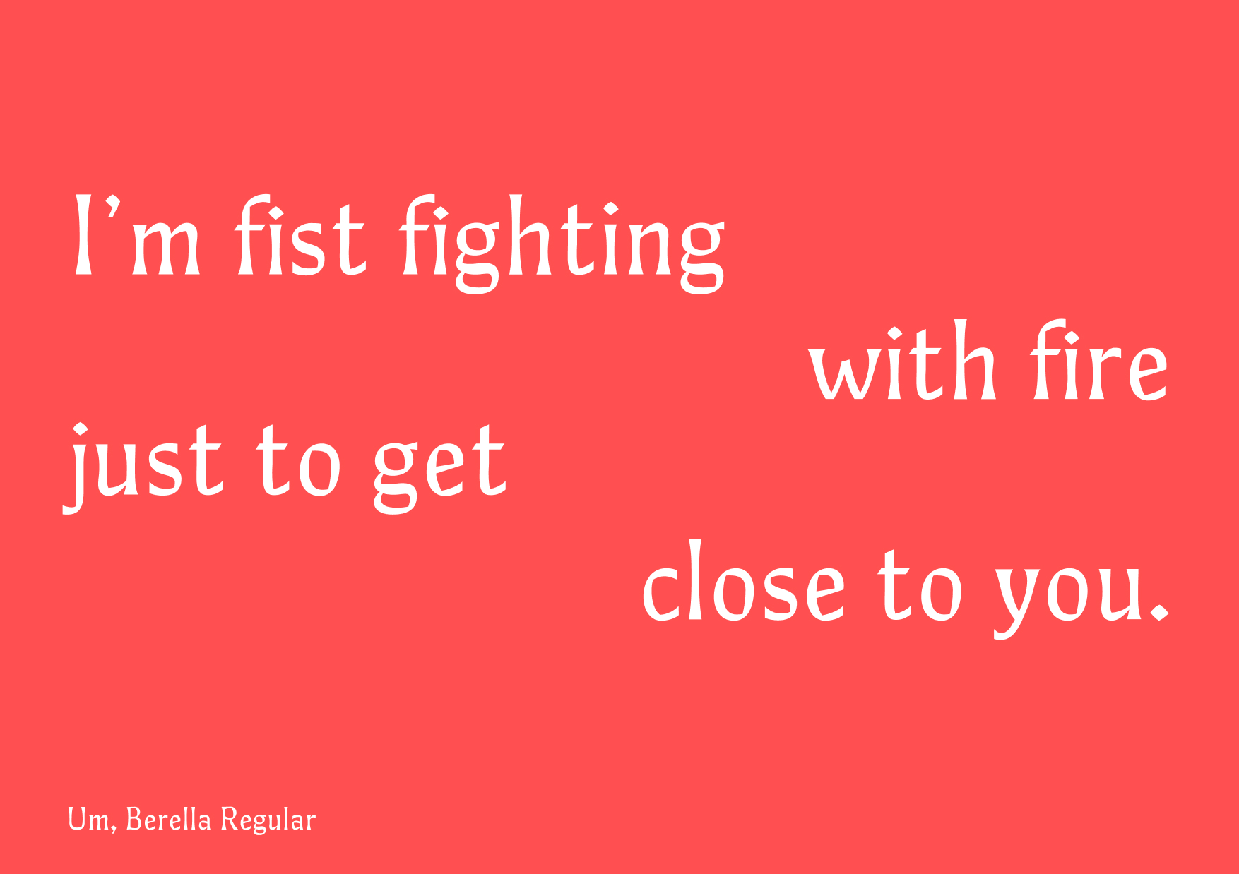
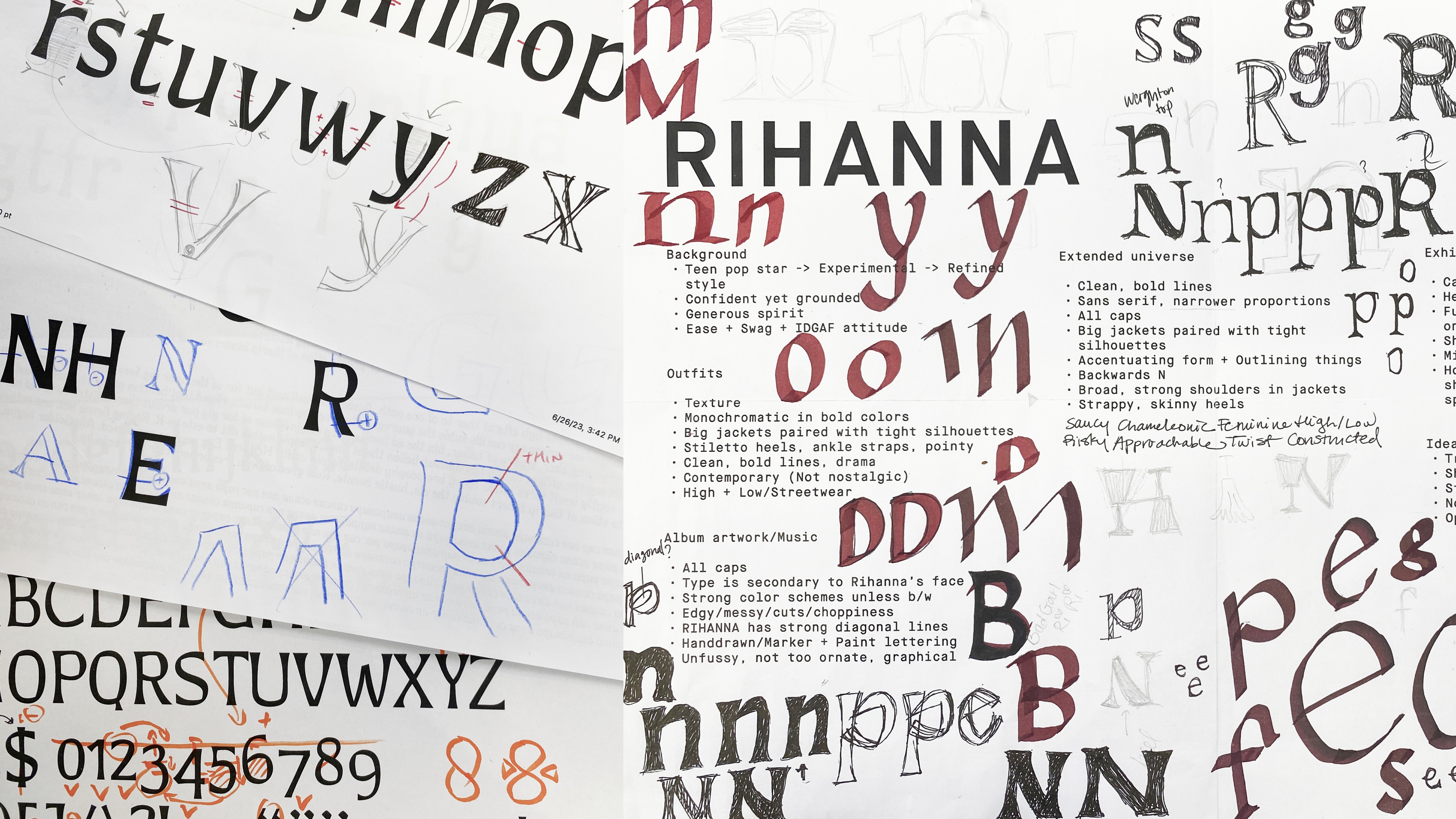
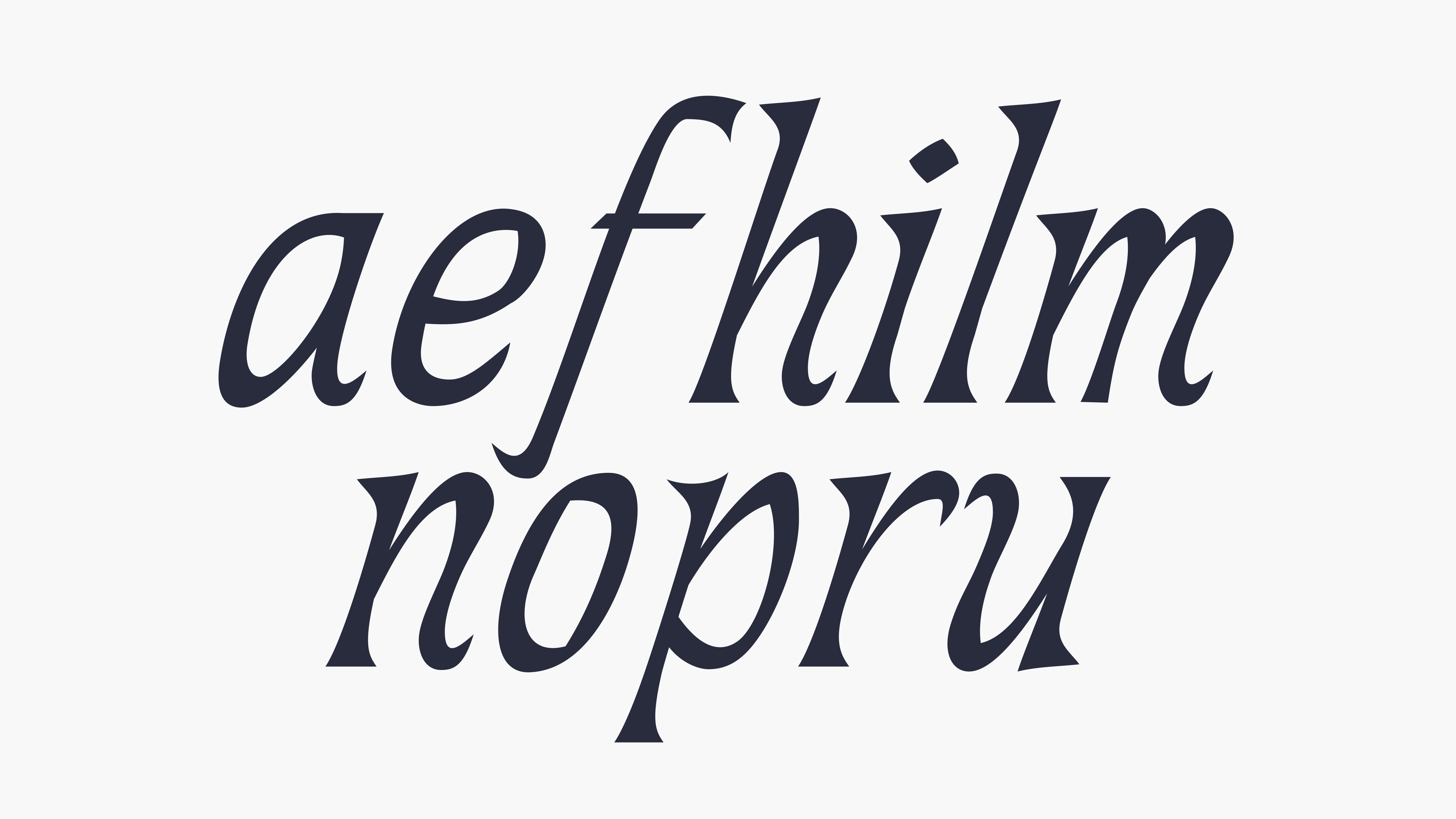
Um, Berella
Um, Berella is a flared serif typeface family inspired by the style, attitude, and vision of Rihanna — global pop sensation, style and cultural icon, entrepreneur, and designer. Its snatched waists, accentuated curves, assertive joins, and tension between its outer curvature and inner obtuse angles borrow the common tropes exhibited by Rihanna’s design preferences.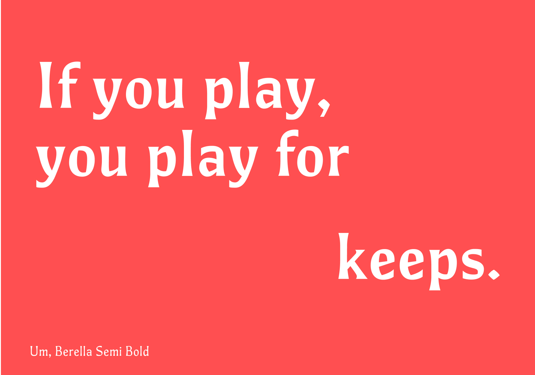

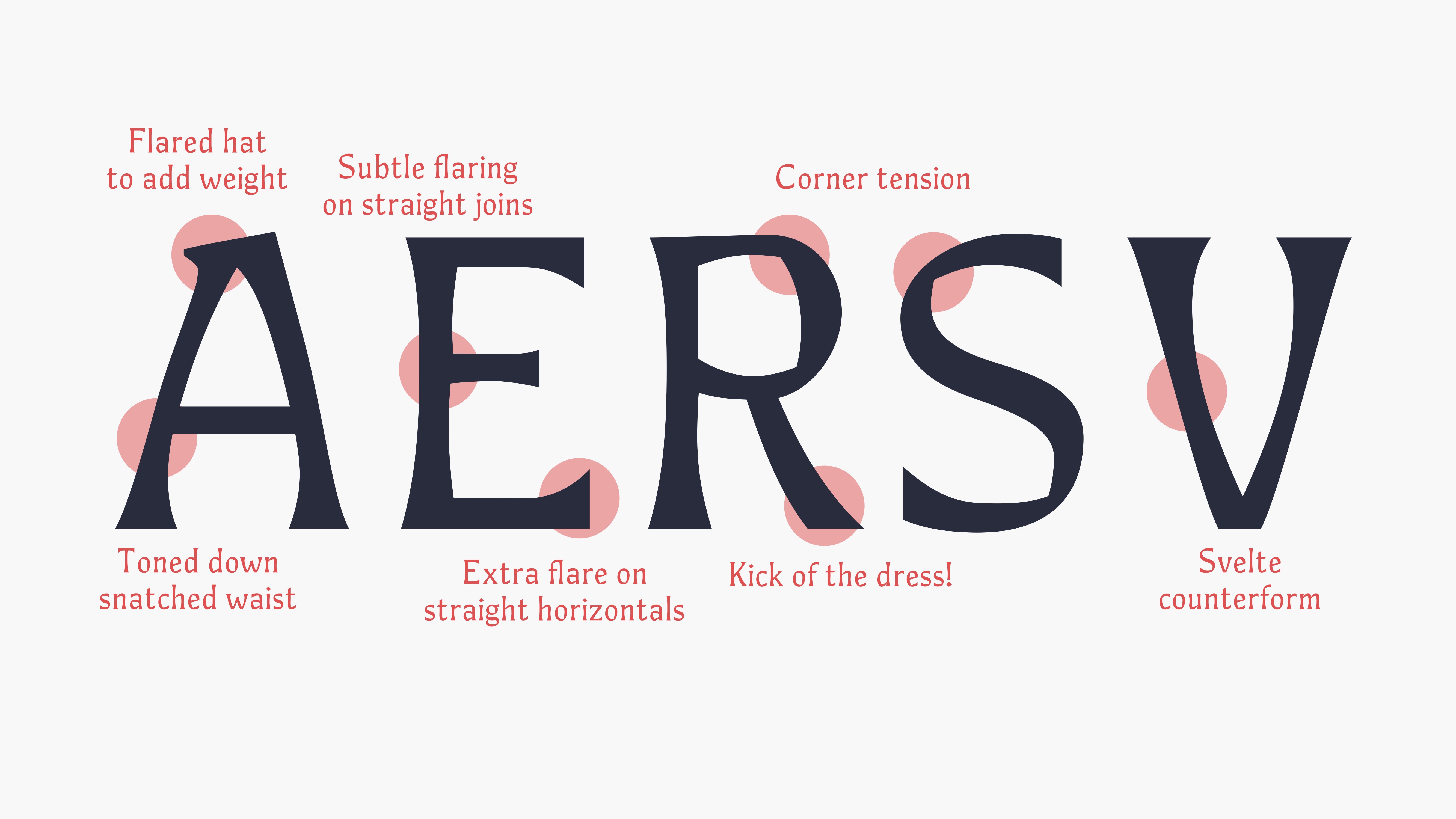
The geometry involves pointed shapes, but rarely uses boring right angles and triangles. The features are drawn decisively and full of attention to construction, with no frilliness or extraneousness. The curves and flares are never too overt to veer into clownish territory. We mean business here.
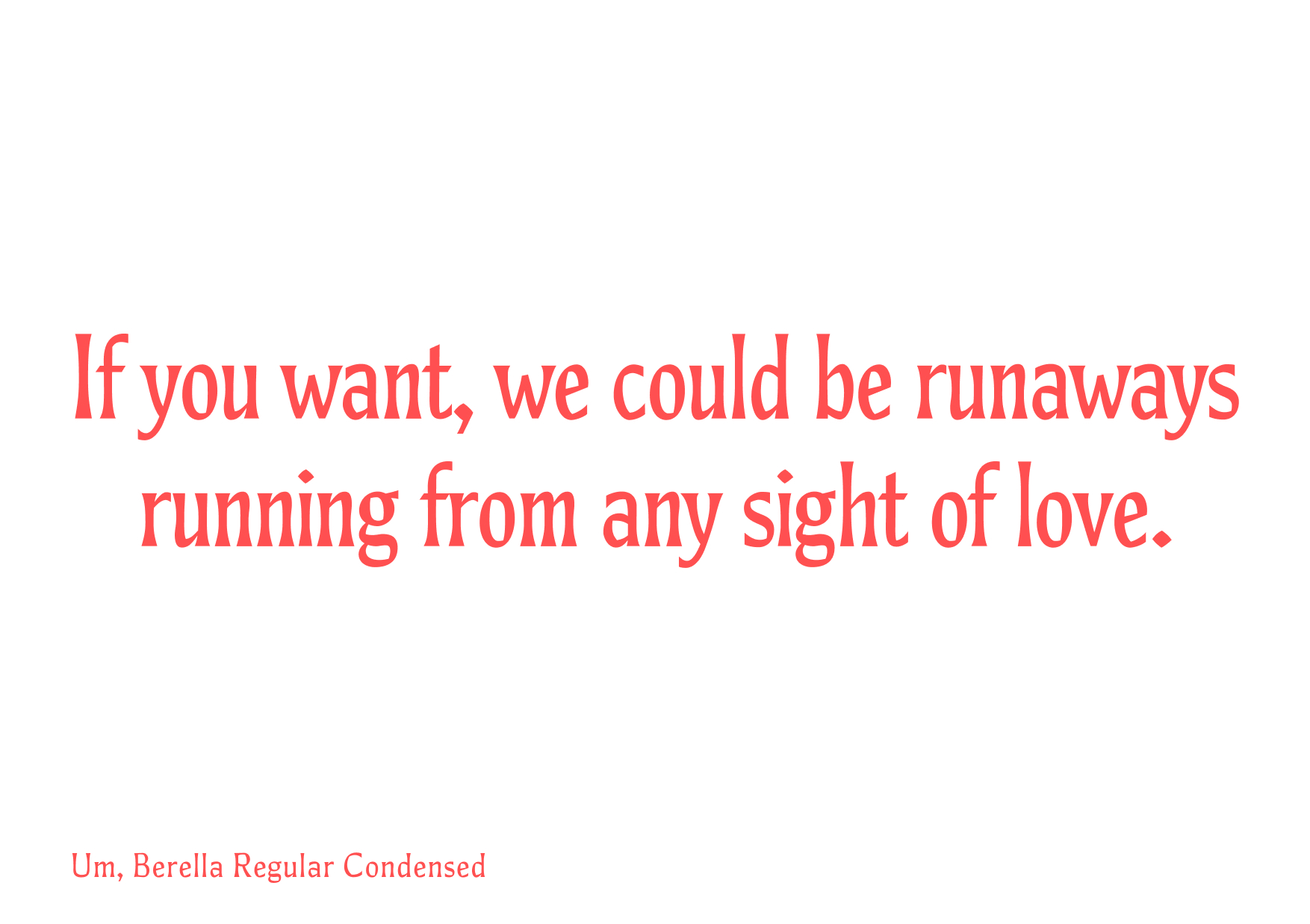
The Regular weight serves well as an approachable and versatile style for text and headline applications. Keeping its inner angles from being too sharp ensures that there’s never too much to disrupt the gently undulating rhythm of a paragraph of text. The snatched waist is not too snatched, to veer too far away from the reliable calligraphic modulation and forms that make ease readers across an even grey of text. At the same time, the slightly condensed proportions make it feel contemporary and fit words well in a headline setting.

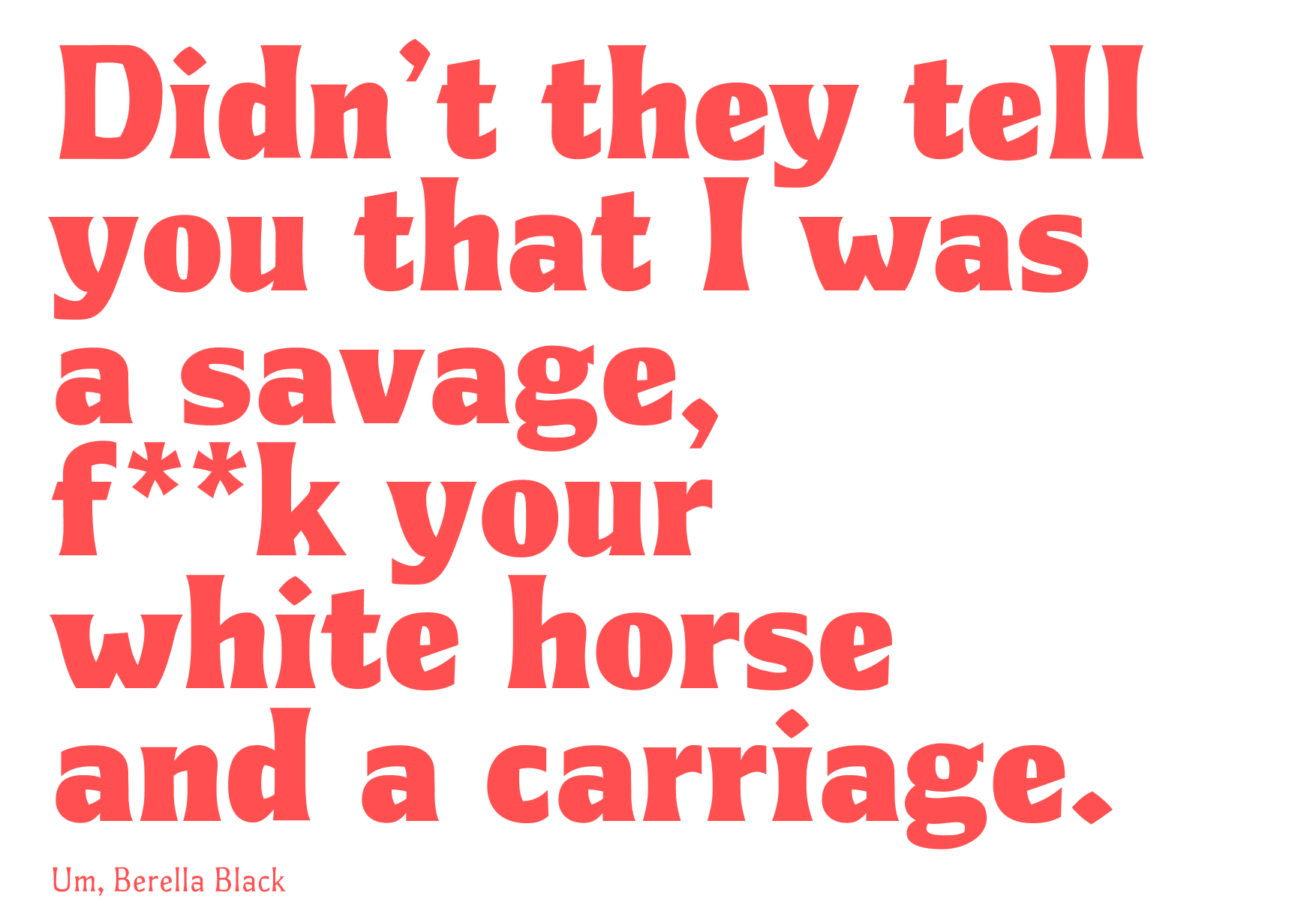
The rest of the family demonstrates the chameleonic quality Um, Berella shares with its inspiration. All the way in the Thin and Light weights, Um, Berella becomes more delicate and intricate. The glyphs bare their soul while still quietly evoking its sharps and curves. It is ballad Rihanna. On the opposite extreme, the Black and Pitch Black weights put on the swagger that a big, structured jacket brings to an outfit, as Rihanna frequently demonstrates in her street style. They take up space, round out their sharpness, bring a little sauce to the table, and speak loudly. It is the brash, no-holds-barred attitude Rihanna.
The condensed weights amp up the fashion and confidence of Um, Berella even further. It exudes the energy of walking tall in a good pair of heels and carrying your shoulders high. The x-height is not adjusted significantly, which makes it slightly less readable than the Regular weight, however it is more striking as a display weight instead.