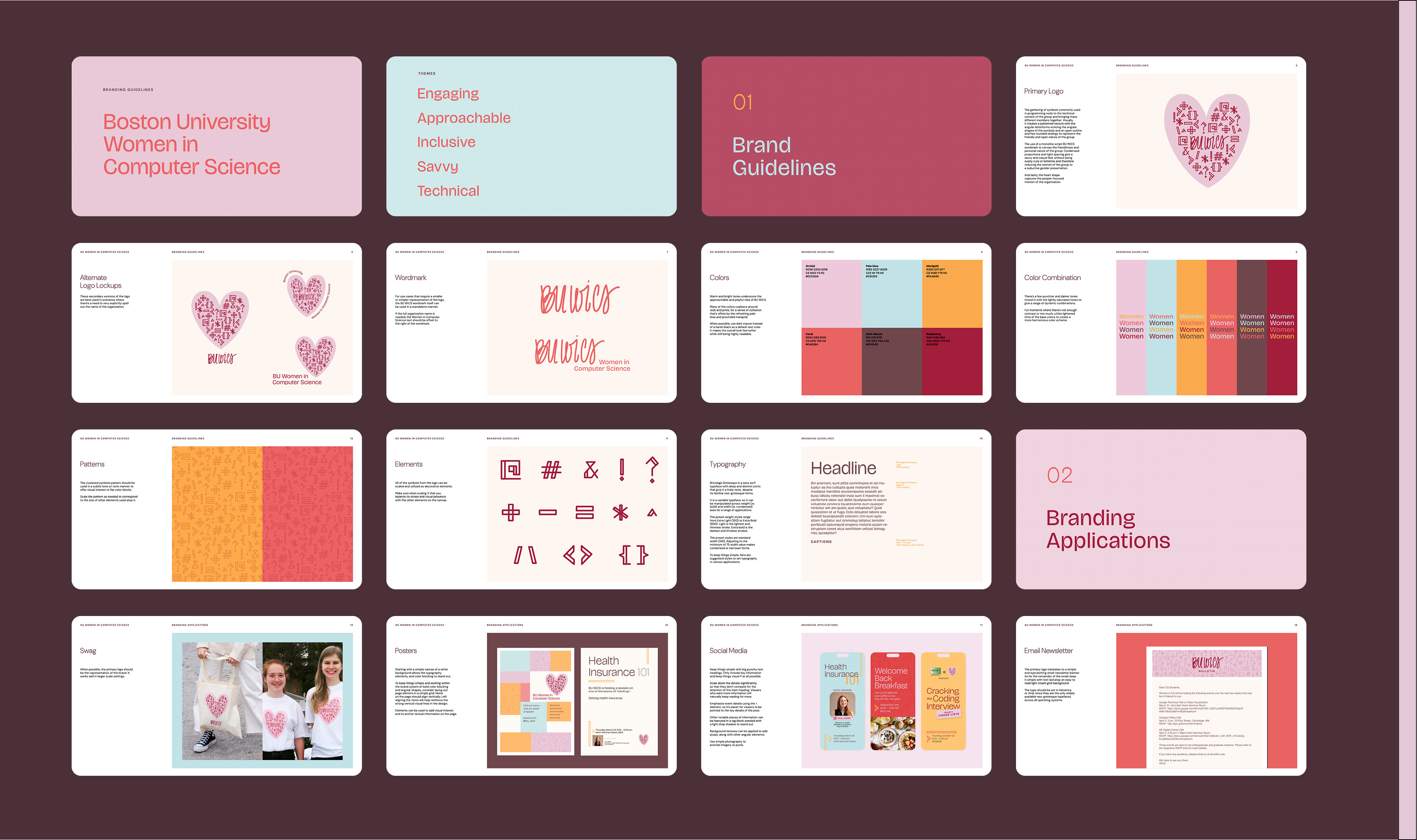
Boston University Women in Computer Science (WiCS) Branding
BU WiCS is an organization focused on fostering a sense of community and empowering students in the BU Computer Science department, with a focus on female students who have historically been significantly out-numbered in the department. The board members wanted new branding that felt more inviting, more engaging, and more memorable.![]()
The use of a monoline script BU WiCS wordmark conveys the friendliness and personal nature of the group. Condensed proportions give a savvy and casual feel, without being overly cute or feminine and therefore confining the group to a reductive gender presentation.

The gathering of symbols commonly used in programming nods to the technical context of the group and bringing many different members together. Employing an open outline style and rounded endings, the symbols still feel friendly and open without the patterned texture being too busy or harsh.

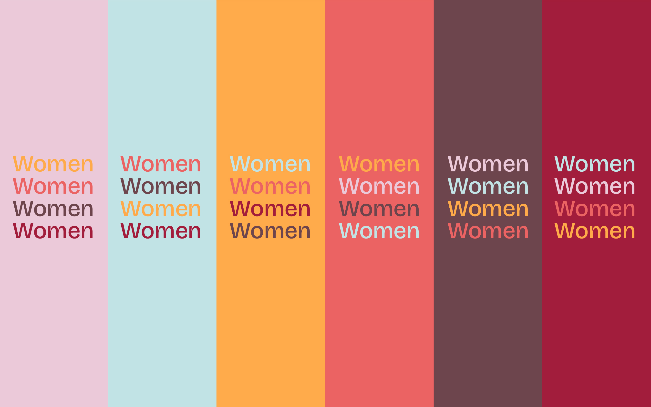

All the elements and colors work together to ground the quirky identity and give a flexible yet simple toolbox for future BU WiCS board members to design collateral in the system. It was crucial to have lots of elements they can work off of as they are, since the system will be managed by people without a design background.